Friday, July 15, 2011

Grandmaster - Art update

Welcome back!
I've made significant progress on the Grandmaster since my last post (in addition to a ton of freelance work that I may post later, pending client-approval), so without further ado, here are some pics!


Front view of Grandmaster sculpt in Mudbox viewport.


Rear view of Grandmaster sculpt in Mudbox.


After getting the base sculpt for the character done, I decided to try my hand at doing some hand-painted texture work. Mudbox has a really neat feature that enables you to paint directly on the high-resolution model and then export the layers to Photoshop. I don't think there was a better way to tackle such a complex model... painting all those feathers in Photoshop would have been a nightmare!


After laying down the base textures, I exported everything back into 3DS Max and assembled the base textures utilizing Xoluil's DirectX 9 shader, which I can't recommend enough. (Find it here:http://www.laurenscorijn.com/viewportshader)

On to armor!


As part of the guidelines I made for myself for Grandmaster's character, I aimed to design a set of armor that was primarily functional, with little bits of ornamentation to indicate his status as a trainer of his tribe's warrior caste. I looked a lot at clothing designs for native peoples around the world, and was intrigued by the intricate wood-carving patterns of the Maori people of New Zealand.


I tried to emulate some of their motifs into the wooden parts of his breastplate.


Click both images for a closer look.


More updates incoming! Stay-tuned!

-Jas

Thursday, April 21, 2011

New ventures, new focus

Heya!
New on the drawing board this time is a character. I had an opportunity to really double-down on my character modeling, rigging and animation skills the last few months, and decided to bring them all together in a portfolio project that I've been kicking around: The Grandmaster!

Initial concepts of The Grandmaster from my sketchpad

More sketchpad pieces. Figuring out costuming and proportions...


The inital idea for the Grandmaster was to challenge myself to create a non-human character as part of a Mudbox contest on cghub.com. The idea was for an aged warrior from an anthropomorphic bird race. The biggest challenge was figuring out his hands.


Base mesh starting in 3DS Max

Back view - Wireframe - still working out mesh flow here.

Big update here. Added wing details and head!

Back view. Feathers on wings!

Head Detail shot!

As you can see, he's still a work in progress, but I'll keep you posted as he develops!

Take care!
-Jason


Wednesday, March 10, 2010

Life is AWSM!

Wow look at the time! Has it really been 5 months since my last post? Unforgivable. Must remedy that.

After a short contract artist job at SCEA I'm back on the streets, hungry for work. In the mean time, I've been frequenting a lot more 3D forums lately. My favorite by far is Polycount.com. One of my favorite parts of their forum is their "Game Art Workshops," where artists all work on the same project, and collaborate on techniques and theories. It's been a great way to learn, but also get some great portfolio work out of it.

This past project involved modeling the stock piece of an Arctic Warfare Sniper Magnum rifle, or AWSM. (or AWP, for those who play Half-Life Counterstrike)


The Beast

I began by downloading a huge collection of reference images to give me an idea of the dimensions and volumes throughout the rifle. I then took a pure side view, projected it onto a background plane, and began blocking it out using a single polygon.

One polygon is where it starts

I tried to pay special attention to the flow of the mesh, as when you are working with high-polygon objects, the cleaner your base is, the better the results will be later.

Note the flow of the center lines down the mesh.

The stock was deceptively complicated, particularly around the handle area, where there are lots of sharp angles that meet at curves. The best thing about working in 3DS Max (my 3D program of choice for modeling these days) is that the "turbosmooth" modifier works with the stack itself. You can easily switch back and forth so see exactly how your low poly mesh is influencing the high poly final.

High Poly with bolt and barrel blocked-in.

Another angle.

Not simply content with modeling the stock of the rifle, I decided to go whole-hog and model the rest! It took several hours spread in and around my freelance work, but I wrapped it up! I'm currently in the process of creating a low-poly version to map the high-poly to, and then provide a final texture. In the mean time, let us both bask in the loveliness that is high-poly.


Hard to believe it all started with a single polygon. There's a metaphor for life somewhere in there I think. I'll have more updates in the coming days, so stay tuned!

-Jason

Friday, October 16, 2009

Marooned...

Hello!
As promised, I'm back again with a look at some high-polygon stuff that I've been cooking up.

This time it's again more character stuff, and I'm really excited to show you my progress. I've been working with a great group of guys that have been working on a project that we will eventually enter into Microsoft's annual "Dream Build Play" contest for their XNA platform. Together, we're called Marooned Games. And our first title is pretty darn ambitious. But hey, go big or go home, right?


click the image above for a closer look


The premise of the game follows a similar style to Metroid, but with a much scarier style. The game opens with the player crash-landing on a barren planet, upon which they discover an abandoned military research facility that is overrun with escaped experiments. We're planning on making the game pretty intense as far as atmosphere goes. Expect lots of gross creatures and jump scares.

click the image above for a closer look

As one of two artists on the project, I've had to do a lot of concept work in addition to all my usual 3D duties. And while I have no chance of becoming the next Ralph McQuarrie or Craig Mullins, I've had a lot of fun spending hours thinking up the look and feel of an entire universe. Suffice to say, it's addictive!

click the image above for a closer look


Most of my concept time has been devoted to the player character himself . The team decided that there would be three upgrades to the characters suit. The first being the astronaut/flight suit that the player crash-lands in. The player acquires the second suit while exploring the military facility, and thus is geared towards combat. The third is an experimental suit that greatly enhances the player's abilities, and in my opinion, makes him look really cool.

click the image above for a closer look

After finalizing the first suit concept, I created a turnaround sketch and began modeling. After getting the base mesh to a workable state, I tweaked the proportions a little to make it a little more realistic (the concept reads a little too "stubby" in 3D I think). After that, it was into Mudbox!


click the images above for a closer look

I really like sculpting. It's so liberating to be able to just attack a mesh without having to worry about where vertices and edges are. I think the results speak for themselves. The sculpt isn't quite done yet (still need details on forearms, hands and torso), but I am extremely happy with what I've got so far, and can't wait to finish it.

Until next time!

Monday, October 12, 2009

Low-Polygon Character Modeling...

Hello again!
Thought I'd shoot a quick update to the intertrons to show what I've been up to lately. In addition to looking for full-time employment, I'm finding myself juggling several projects at once! This time it was a month-long contest held on the polycount.com forums.

The contest called for a low-polygon character (or series of characters) that numbered 700 triangles or fewer designed for a mobile device, such as a Nintendo DS or Sony PSP. The theme was an action movie side-scrolling brawler, such as Final Fight or Streets of Rage.


"Final Fight:" The perennial "Beat dudes up until they disappear" game.

One of my favorite action movies of all time is "The Seven Samurai" directed by Akira Kurosawa. It's one of those kinds of movies in which every time you watch it, you notice something new. I also thought that the idea of a side-scrolling brawler set in feudal Japan sounded pretty awesome as well. I decided to model the leader of the Seven, Kanbei.


Best. Sideburns. Ever.

Modeling a low-poly character is really tough! You really have to make every vertex and line count. Texture space is also super-important. The contest only allowed a single 512x512 map for the entire character.


Click the Image for a larger view

For every additional character after the first one, the limits were even tougher. You couldn't use more than 500 triangles, and the texture sizes were reduced even further! Nonetheless, I decided to include a bandit character for Kanbei to fight against.


Click Image above for a larger view

In addition to modeling and texturing both characters, I also created a custom rig that is shared by both of them. It makes use of IK and some basic controls for moving and controlling several groups of bones at once.


Click the above image for a closer look

So there we go. That's what I've been up to lately. Check back later this week when I'll give you a dose of High-Detail stuff that will blow your mind! Until next time!

Tuesday, September 22, 2009

New Project - Alien Sushi Hut

Greetings yet again!

Way back in college, I had an idea for a short animated film that involved a kind of "planetary prison;" a penal colony set up on a desolate world where life was rough and alien criminals from all over would have to band together in order to survive. Kind of like the country of Australia... with aliens! I had sculpted two of the main characters as an assignment for one of my classes, but unfortunately since then they had accidentally been nudged off their display table and are now in several pieces...

Anyway, fast-forward a few years. This past summer I saw the fantastic film "District 9," directed by Neill Blomkampf and suddenly my idea of aliens marooned on a desolate planet jumped back into my head


One of the more compelling ideas was for an open-air marketplace, where beings could gather and exchange goods. Learning from my previous experience with my train station, I decided to double-down on a single shack; a micro-level environment, packed with detail and character, and see what I could do. *Poof!* The alien sushi hut was born.


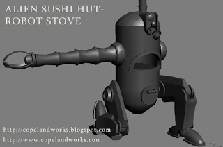
The big points I wanted to hit were Character, Detail, and Color. An opportunity to make a ramshackle food stall made up of scavenged materials makes for a lot of interesting scenarios. For the centerpiece of the stall I wanted something anachronistic. Something that under normal circumstances would have no business being used to make food for hungry patrons. I settled on an old busted robot being used as a stove.


As you can see I've begun the initial modeling for pieces in the environment, and it's been a lot of fun adding all kinds of dents and chips in the models themselves. I hope to take a lot of them into Mudbox and really go to town on the normal maps. I have the basic UV layouts set up on all of my finished models, and hope to get started on texturing very soon!

As for the hut itself, I have a basic layout set (the semi-transparent shell in the image below), and I hope to cover it in corrugated metal, wood, etc. All in all I'm very excited about this project, and can't wait to show you more! Until next time!


Post-Mortem - Train Station Environment

Well, that was quick huh?

Alright, so for my last big portfolio project I had hoped to construct a large, spacious environment in the hopes of filling it with all kinds of props and details, as well as try my hand at creating modular pieces of environment (kind of like lego blocks) and piecing them together. Simple huh?


The results? I managed to create a large, expansive environment utilizing only a small number of pieces. I learned a ton about building things in modular pieces, such as a set piece of wall or floor that can then be connected to other pieces in order to create a full environment. Every piece of the Train Station is modular, so it could actually be re-arranged any number of ways.


Overall? I learned a ton. I'm hoping to apply what I learned on this project to my next one. Stay tuned!